pacman::p_load(jsonlite, tidyverse, tidygraph, ggraph, visNetwork, lubridate, igraph, ggplot2, dplyr, magrittr)Take-home_Ex02
Data Preparation
Install and load the packages
Load the dataset in JSON format
mc2_data <- fromJSON("C:/Fay1109/ISSS608-VAA/Take-home_Ex/Take-home_Ex02/data/mc2_challenge_graph.json")Data Wrangling
Extracting the nodes and links
The code chunk is used to extract nodes/edges data tables from MC2 list object and save the output in a tibble data frame object called MC2_nodes and MC2_edges.
mc2_nodes <- as_tibble(mc2_data$nodes) %>%
  select(id, shpcountry, rcvcountry)
mc2_edges <- as_tibble(mc2_data$links) %>%
mutate(ArrivalDate = ymd(arrivaldate)) %>%
mutate(Year = year(ArrivalDate)) %>%
select(source, target, ArrivalDate, Year, hscode, valueofgoods_omu,
volumeteu, weightkg, valueofgoodsusd) %>%
distinct()Map hscode to corresponding fish type.
mc2_edges_mapped <- mc2_edges %>%
  mutate(fishtype = case_when(
    startsWith(hscode, "301") ~ "live fish",
    startsWith(hscode, "302") ~ "fresh fish",
    startsWith(hscode, "303") ~ "frozen fish",
    startsWith(hscode, "304") ~ "fish meat",
    startsWith(hscode, "305") ~ "processed fish",
    startsWith(hscode, "306") ~ "crustaceans",  #like lobster or shrimps
    startsWith(hscode, "307") ~ "molluscs",  #like Oysters or Abalone
    startsWith(hscode, "308") ~ "aquatic invertebrates", #like Sea cucumbers?
    startsWith(hscode, "309") ~ "seafood flours",  #fish powder, shrimp powder?
    TRUE ~ "not fish"
  ))
Visualization
The graph below shows the number of counts in different fish categories being traded along the time. Fish meat is transported with the most frequent times in each year, followed by crustaceans
library(ggplot2)

# Group the data by fishtype and Year and calculate the count
fish_counts <- mc2_edges_mapped %>%
  filter(fishtype != "not fish") %>%
  group_by(fishtype, Year) %>%
  summarise(count = n())
`summarise()` has grouped output by 'fishtype'. You can override using the
`.groups` argument.# Plot the graph
ggplot(fish_counts, aes(x = Year, y = count, fill = fishtype)) +
geom_bar(stat = "identity", position = "stack") +
labs(x = "Year", y = "Count", fill = "Fish Category") +
scale_fill_discrete(name = "Fish Category") +
scale_y_continuous(labels = function(x) format(x, big.mark = ",")) +
theme_minimal()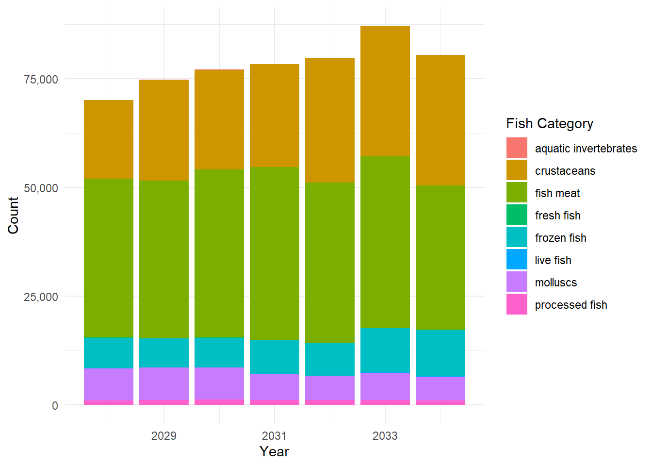
This is the graph showing the distribution of number of companies shipping different types of products. It can be seen that fish meat is shipped by most companies, followed by frozen fish. Live fish and aquatic invertebrates are the least two product categories shipped by companies.
library(ggplot2)
library(dplyr)
library(magrittr)
# Filter out the "not fish" category
filtered_data <- mc2_edges_mapped %>%
  filter(fishtype != "not fish") %>%
  distinct(source, fishtype)

# Group the data by fishtype and calculate the number of unique companies
fish_counts <- filtered_data %>%
  group_by(fishtype) %>%
  summarise(count = n_distinct(source))

# Plot the bar chart
ggplot(fish_counts, aes(x = fishtype, y = count)) +
  geom_bar(stat = "identity", fill = "steelblue") +
  labs(x = "Fish Type", y = "Number of Companies") +
  theme_minimal() +
  theme(axis.text.x = element_text(angle = 45, hjust = 1))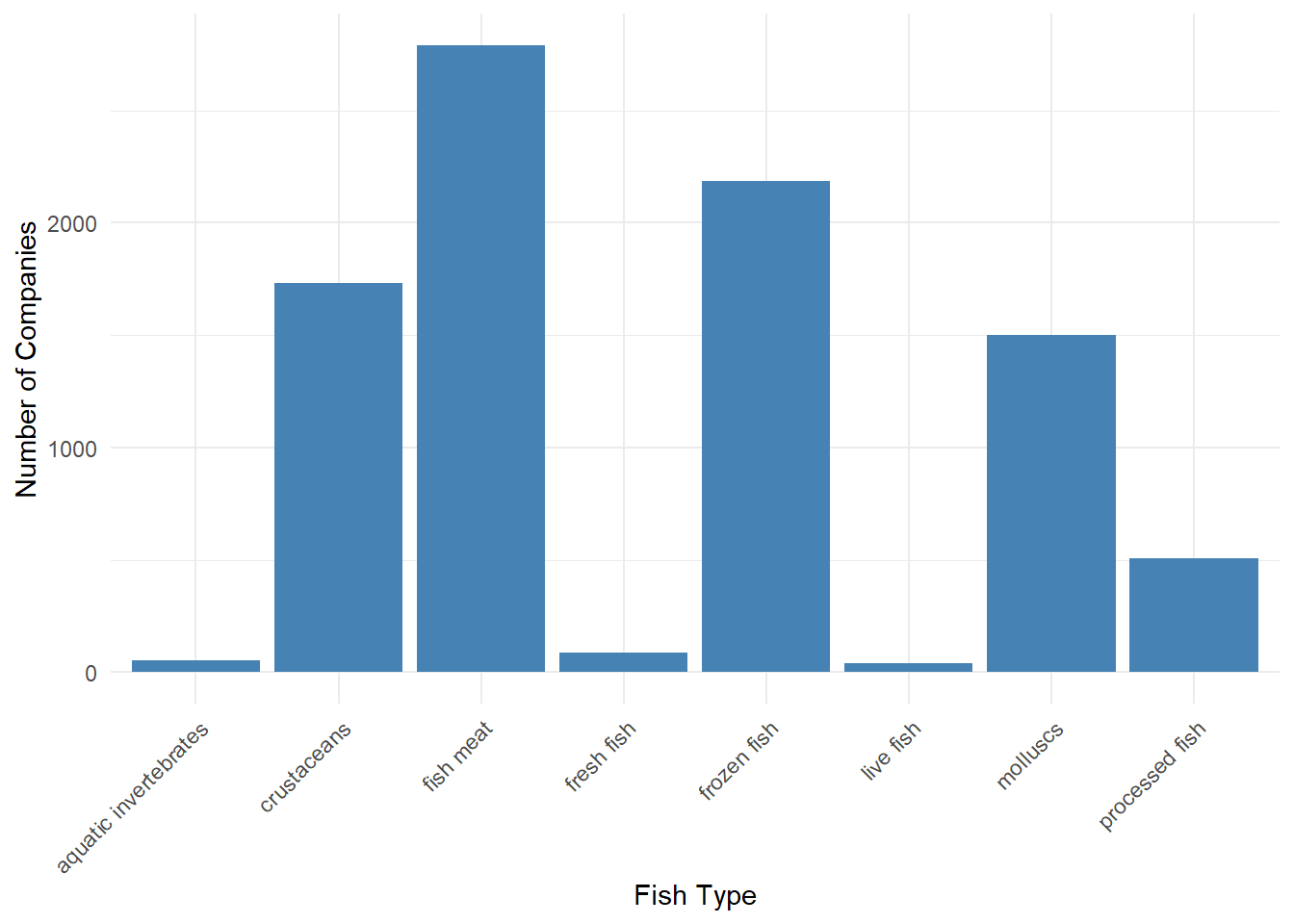
Here is the line chart to show the changes of shipments in different fish types. It can be seen that live fish and processed fish does not change too much in number of shipments. Fish meat and molluscs have some fluctuations in number of shipments and have a decreasing trend from 2033 to 2034. Frozen fish and crustaceans have an increasing trend in number of shipments.
library(ggplot2)
library(scales)
Attaching package: 'scales'The following object is masked from 'package:purrr':
discardThe following object is masked from 'package:readr':
col_factor# Filter out the "not fish" category
fish_counts <- mc2_edges_mapped %>%
filter(fishtype != "not fish") %>%
group_by(fishtype, Year) %>%
summarise(total_count = n())`summarise()` has grouped output by 'fishtype'. You can override using the
`.groups` argument.# Plot the line chart
ggplot(fish_counts, aes(x = Year, y = total_count, color = fishtype, group = fishtype)) +
geom_line() +
geom_point() +
labs(x = "Year", y = "Total Number of Shipments", color = "Fish Category") +
scale_color_discrete(name = "Fish Category") +
theme_minimal() +
theme(legend.position = "right") +
scale_y_continuous(labels = comma)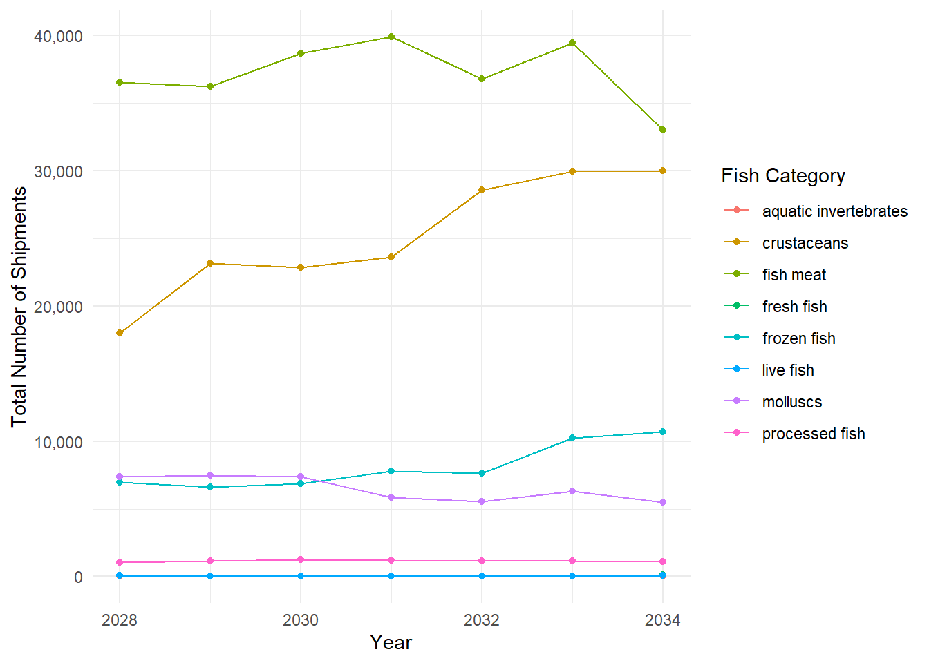
The line chart below shows the total weight of all categories shipped along these years. It can be seen from the graph that total weights of shipment has an increasing trend from the first year to 2032. Then it has a decreasing trend after 2032. One interesting finding is that most shipment reach the peak value of total weights in quarter 3.
library(ggplot2)
library(lubridate)
library(scales)
library(plotly)
Warning: package 'plotly' was built under R version 4.2.3
Attaching package: 'plotly'The following object is masked from 'package:igraph':
groupsThe following object is masked from 'package:ggplot2':
last_plotThe following object is masked from 'package:stats':
filterThe following object is masked from 'package:graphics':
layout# Convert ArrivalDate to a date object
mc2_edges_mapped$ArrivalDate <- ymd(mc2_edges_mapped$ArrivalDate)
# Extract Year and Quarter from ArrivalDate
mc2_edges_mapped$Year <- year(mc2_edges_mapped$ArrivalDate)
mc2_edges_mapped$Quarter <- quarter(mc2_edges_mapped$ArrivalDate)
# Group the data by Year and Quarter and calculate the total weightkg
weight_by_quarter <- mc2_edges_mapped %>%
group_by(Year, Quarter) %>%
summarise(total_weight = sum(weightkg))`summarise()` has grouped output by 'Year'. You can override using the
`.groups` argument.# Create a combined Year-Quarter label
weight_by_quarter$YearQuarter <- paste(weight_by_quarter$Year, weight_by_quarter$Quarter, sep = ", ")
# Get the unique years
unique_years <- unique(weight_by_quarter$Year)
# Plot the line graph with modified x-axis labels
p <- ggplot(weight_by_quarter, aes(x = YearQuarter, y = total_weight, group = 1)) +
geom_line() +
geom_point() +
labs(x = "Year", y = "Total Weight (kg)") +
theme_minimal() +
scale_x_discrete(labels = function(x) {
ifelse(grepl(", 1", x), c(gsub(",.*", "", x), unique_years[match(gsub(",.*", "", x), unique_years)]), "")
}, expand = c(0, 0)) +
scale_y_continuous(labels = scales::comma, limits = c(0, max(weight_by_quarter$total_weight) * 1.1), expand = c(0, 0))
# Convert the ggplot object to plotly
p <- ggplotly(p, tooltip = c("x", "y"))
# Display the interactive plot
pThis is the line showing the change in total weights of shipment in different fish types. The trend of line in each fish type is very similar to the line plotting the number of shipments in each fish type, which is quite reasonable.
library(ggplot2)
library(lubridate)
library(scales)
library(plotly)

# Convert ArrivalDate to a date object
mc2_edges_mapped$ArrivalDate <- ymd(mc2_edges_mapped$ArrivalDate)

# Extract Year and Quarter from ArrivalDate
mc2_edges_mapped$Year <- year(mc2_edges_mapped$ArrivalDate)
mc2_edges_mapped$Quarter <- quarter(mc2_edges_mapped$ArrivalDate)

# Filter out the "not fish" category
fish_weights <- mc2_edges_mapped %>%
  filter(fishtype != "not fish") %>%
  group_by(fishtype, Year) %>%
  summarise(total_weight = sum(weightkg))
`summarise()` has grouped output by 'fishtype'. You can override using the
`.groups` argument.# Create a combined Year-Quarter label
fish_weights$YearQuarter <- paste(fish_weights$Year, fish_weights$Quarter, sep = ", ")Warning: Unknown or uninitialised column: `Quarter`.# Plot the line chart
p <- ggplot(fish_weights, aes(x = YearQuarter, y = total_weight, color = fishtype, group = fishtype)) +
geom_line() +
geom_point() +
labs(x = "Year", y = "Total Weight (kg)", color = "Fish Category") +
scale_color_discrete(name = "Fish Category") +
theme_minimal() +
theme(legend.position = "right") +
scale_y_continuous(labels = comma)
# Convert the ggplot object to plotly
p <- ggplotly(p, tooltip = c("x", "y"))
# Display the interactive plot
pmc2_edges_aggregated <- mc2_edges_mapped %>%
filter(fishtype != "no fish") %>%
mutate(Year = as.character(Year), Quarter = as.character(Quarter)) %>%
filter((Year == "2032" & Quarter == "3") | (Year != "2032")) %>%
group_by(source, target, fishtype, Year) %>%
summarise(weights = n()) %>%
filter(source != target) %>%
filter(weights > 20) %>%
ungroup()`summarise()` has grouped output by 'source', 'target', 'fishtype'. You can
override using the `.groups` argument.id1 <- mc2_edges_aggregated %>%
select(source) %>%
rename(id = source)
id2 <- mc2_edges_aggregated %>%
select(target) %>%
rename(id = target)
mc2_nodes_extracted <- rbind(id1, id2) %>%
distinct()mc2_graph <- tbl_graph(nodes = mc2_nodes_extracted,
edges = mc2_edges_aggregated,
directed = TRUE)ggraph(mc2_graph,
layout = "fr") +
geom_edge_link(aes()) +
geom_node_point(aes()) +
theme_graph()Warning: Using the `size` aesthetic in this geom was deprecated in ggplot2 3.4.0.
ℹ Please use `linewidth` in the `default_aes` field and elsewhere instead.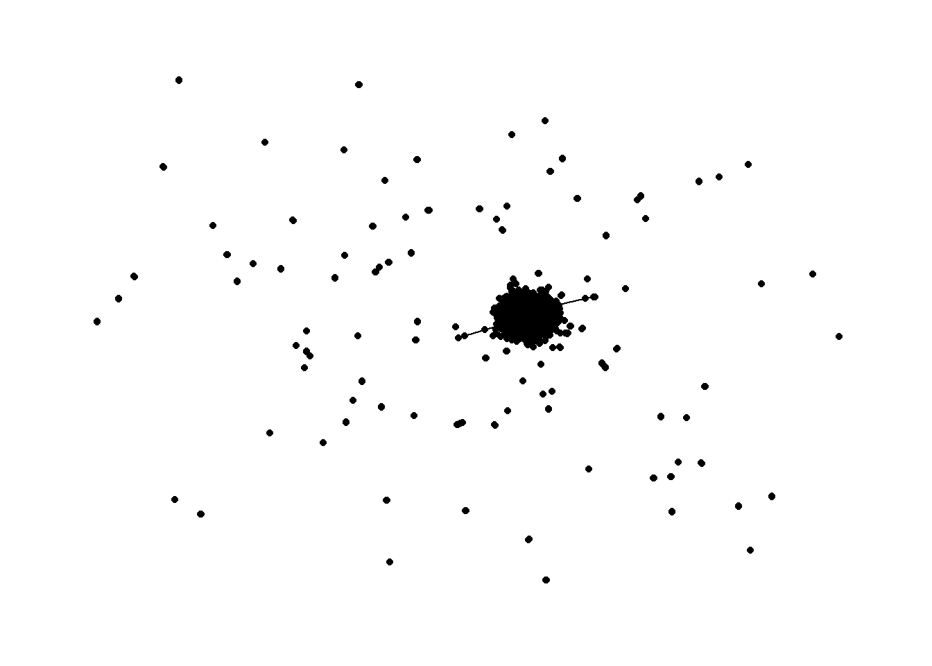
edges_df <- mc2_graph %>%
  activate(edges) %>%
  as.tibble()
Warning: `as.tibble()` was deprecated in tibble 2.0.0.
ℹ Please use `as_tibble()` instead.
ℹ The signature and semantics have changed, see `?as_tibble`.write_rds(mc2_nodes_extracted, "data/mc2_nodes_extracted.rds")
write_rds(mc2_edges_aggregated, "data/mc2_edges_aggregated.rds")
write_rds(mc2_graph, "data/mc2_graph.rds")mc2_graph# A tbl_graph: 6664 nodes and 35991 edges
#
# A directed multigraph with 104 components
#
# A tibble: 6,664 × 1
id
<chr>
1 " Direct Limited Liability Company Shipping"
2 " Direct S.A. de C.V."
3 " Direct Shark Oyj Marine sanctuary"
4 "-28"
5 "-64"
6 "1 AS Marine sanctuary"
# ℹ 6,658 more rows
#
# A tibble: 35,991 × 5
from to fishtype Year weights
<int> <int> <chr> <chr> <int>
1 1 3848 not fish 2028 25
2 1 3848 not fish 2029 28
3 2 3849 not fish 2033 35
# ℹ 35,988 more rowsedges_df <- mc2_graph %>%
activate(edges) %>%
as.tibble()nodes_df <- mc2_graph %>%
activate(nodes) %>%
as_tibble() %>%
rename(label = id) %>%
mutate(id = row_number())The network below shows the interaction between shipping and receiving countries. The graph represents various nodes (representing entities such as countries or regions) and edges (representing trade connections). visNetwork function is used to create the graph, with the nodes and edges as input. The layout of the graph is determined by the “layout_with_fr” option, which utilizes the Fruchterman-Reingold algorithm. The edges are displayed with curved arrows for visual clarity.
library(visNetwork)
library(igraph)

# Create the graph from the data frame
graph <- graph_from_data_frame(mc2_edges, directed = FALSE)

# Calculate the number of edges for each node (node degrees)
node_degrees <- degree(graph)

# Sort the nodes based on the number of edges in descending order
sorted_nodes <- nodes_df[order(-node_degrees), ]

# Get the top 20 nodes
top_twenty_nodes <- sorted_nodes[1:20, ]

# Create the visNetwork graph
visNetwork(nodes_df, edges_df, main = "FishEye Trade Network") %>%
  visIgraphLayout(layout = "layout_with_fr") %>%
  visEdges(arrows = "to", smooth = list(enabled = TRUE, type = "curvedCW")) %>%
  visNodes(label = nodes_df$label, title = nodes_df$label) %>%
  visOptions(highlightNearest = list(enabled = TRUE, hover = TRUE),
             nodesIdSelection = TRUE,
             selectedBy = "label") %>%
  visInteraction(hover = TRUE) %>%
  visNodes(id = top_twenty_nodes$id, borderWidth = 3, color = list(border = "red")) %>%
  visNodes(id = setdiff(nodes_df$id, top_twenty_nodes$id), color = list(border = "gray"))